Eat, Play, Lounge
See how seven designers created outdoor environments for everything from intimate dining nooks to kidcentric playscapes.

The secret of successful outdoor entertaining is to set the stage in a way that fits the occasion. We take a look at how seven designers created carefully conceived enviroments for everything from intimate dining nooks to kidcentric playscapes.
EAT
Most people see outdoor dining as a more relaxed endeavor than its indoor counterpart. Perhaps the most important planning point is to connect the dining area to its surroundings. Going alfresco requires a certain flexibility of spirit—you are not in charge of the sun, moon, clouds, or rain. What you can do is design in anticipation of all possible variables.
Lunches in a hot sun will be more comfortable under a pergola or trellis topped with vines, cloth, or woven bamboo or reed fencing. For post-sundown dining you may want a more open setting so views of night sky are unrestricted. Furnishing should be waterproof, unless you're willing to replace them often.
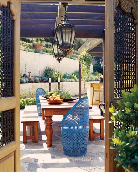
Left: Interior designer Jeff Andrews created a 12-foot-long teak dining table that doubles as a buffet for his client; benches reduce clutter in the high-traffic area, and vintage Moroccan metal end chairs add personality.

EAT
Vintage furniture suits the outdoors, especially when refinished with a more modern sensibility, as in the old hotel chairs designers Eric Ossart and Arnaud Maurières found for the terrace of the Taroudant, Morocco, boutique hotel Dar al Hossoun.
"They're plastic chairs from the '70s that were originally a shocking blue," says Maurières. "We repainted them gray-green," a color that picks up on the surrounding 100-acre olive grove.
Guests use the terrace primarily for cocktails at the end of the day, when the scent of the jasmine growing through the fence provides natural aromatherapy.

EAT
When graphic designer George Mimnaugh restored this 1953 Rodney Walker house in Los Angeles, he nestled a travertine-topped table under its minimalist steel arbor. It's a perfect example of how to tie a space to the adjacent architecture.

EAT
Homeowners in Calistoga, California, who are dedicated vegetable gardeners, take farm-to-table dining to a new level. Recycled redwood planters hold eggplant, squash, tomato, and herb plants.
The custom-designed aluminum table has a built-in wine bucket at its center. (This is Napa County, after all.) The trellis, made from recycled steel tubing, creates a defined, intimate area without interrupting the view.
Learn more about gardening in raised beds.

PLAY
One of the biggest challenges for people who are serious about their landscapes is to make them beautiful and also kid-friendly. “I think the solution lies in using plenty of imagination and choosing features carefully,” says U.K. designer Clare Matthews.
The oak boards of this oversize "deck chair" are smooth enough for bare feet, and the angle of its back was carefully set to be "relaxed but not too relaxed." Such raised platforms can be hidden by plantings such as the Stipa arundinacea used here.
Matthews’ daughters (pictured with Matthews) and their pals often turn this deck into a stage, performing for audiences (parents) seated in the grass below.

PLAY
For a Marin, California, family with three children, landscape architect James Lord, a principal at San Francisco’s Surfacedesign Inc., made a necessary land stabilization project do double duty by creating these earth forms the family calls “Hobbit hills.”
The bermed earth stems erosion but also became the neighborhood kids’ favorite play area, sporting a trampoline at the top of one hill and a series of inset chutes made of 4-inch off-the-shelf pipe, perfect for dropping balls and other handy objects into.

PLAY
Surfacedesign Inc. built this Hobbit house for children, but it has an adult-pleasing silhouette.
"So much is handed to kids," says the designer James Lord, "but this makes them use their imaginations." The installation is also not so age-specific that it will fall out of favor with its users any time soon. "My client wanted a garden her children could grow into."

LOUNGE
When it comes to kicking back in the great outdoors, nothing beats comfortable seating. Weight-bearing surfaces should have some give (or be topped with cushions), and anything with motion—such as gliders, hammocks, and swings—is a guaranteed de-stresser.
Architect Alex Pössenbacher, who has designed vacation homes in Mexico and Costa Rica, created the loggia for this house in Costa Careyes on the Pacific coast of Mexico. The covered porch extends off of a bedroom. "The ideas is to create a covelike space that gives a protected feeling but also connects to the exterior," Pössenbacher explains. "And the arches frame the garden and the ocean views."
Inobtrusive footrests and side tables provide useful way stations for drinks, snacks, and reading material, as does the modern coffe table, made of fossilized coral and wood. And, as always, the pleasing and constant background sound of water—here generated by a 16th century stone lavadero—provides a soothing soundtrack for any gathering.
Left: A vaulted ceiling brings elegance to this Mexican terrace, designed by luxury vacation home architect Alex Pössenbacher. The ochre color scheme has a festive feel, but one that’s grounded in earthy undertones and biomorphically shaped wicker chairs (designed by Pössenbacher’s brother Mark).


