Tom Armstrong's Fishers Island Home
When Tom Armstrong's house burned down, the only thing left was the garden. Rebuilding was his chance to let the landscape come first.When Tom and Bunty Armstrong bought a ramshackle summer home on Fishers Island off the Connecticut coast 27 years ago, their first move was to replace the colonial revival’s circular driveway with a straight shot to the front door.

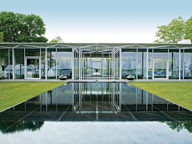
After a devastating fire to the Fishers Island home of Tom and Bunty Armstrong, only the garden survived. The new house, designed by architect Tom Phifer, was built to complement the existing garden. Photo by: Don Freeman.
“I wanted a confrontation with the house—immediately,” Tom Armstrong later told The New York Times. If you go by his press, Armstrong’s career as a museum director echoed his taste in driveways. A former director of the Whitney Museum of American Art and a past president of the Garden Conservancy who died in June at the age of 78, Armstrong was known for public clashes with curators who worked for him and with museum boards he worked for. In person, however, he was charming, impeccably mannered, and often madcap—his Fishers Island house was named Hoover Hall after the superhero persona Armstrong adopted; he often donned a cape, tights, and a vacuum-emblazoned T-shirt for on-island events. Confrontation, friends say, was not a matter of temperament but a design principle.

Creeping juniper and daffodils borders the staircase to the picnic area along the shoreline. Photo by: Don Freeman.
In December 2003, a fire destroyed Hoover Hall. The drive Armstrong reconfigured decades before now led to an empty rectangle of lawn and a bosque of apple trees surrounded by a three-acre garden. Designed by landscape architect Morgan Wheelock in 1989 and constantly improved by Armstrong, the garden had come through unscathed but orphaned. “The garden was premised on the axes of the old house,” says Armstrong’s son Whitney, a Harvard-trained landscape architect. “It took Dad a few months to figure out what to do.”

Lush rows of Japanese iris bloom each June. Photo by: Don Freeman.
As spring came and the garden bloomed unobstructed by Hoover Hall, Armstrong realized he had a rare opportunity to reverse the typical order of garden construction: He could design a house to complement an existing garden. In doing so, he could balance the relationship between structure and garden and protect the ample panoramas the fire produced. He would do it, in effect, by preserving the absence of the old house.
A transparent glass box now stands on the spot once occupied by the old colonial. Fishers Island Sound is visible from either side, and the house’s steel frame melds into its silvery maritime blues and grays. “We didn’t want the house to be the prominent feature,” says its architect, Tom Phifer. “That’s where the transparency comes from.”

The moss garden occupies an atrium-like space outside the library. Photo by: Don Freeman.
At first sight, Phifer’s design appears to float in place, shining and slightly elevated, but from every vantage in the garden, the home feels securely embedded. A conventional swimming pool was reshaped into the water feature that flows into the house, creating a sightline from the road to the Sound. Small adjustments, like trimming the apple trees to the exact height of the new roof, pull the house and garden together.
Next to Phifer’s ethereal building, a paddle tennis court felt out of place, so it was replaced with new plantings. A monolithic black cube—which in context looks like modern sculpture but in fact is a metal storage shed—punctuates contorted white pines and curving beds of Japanese iris.

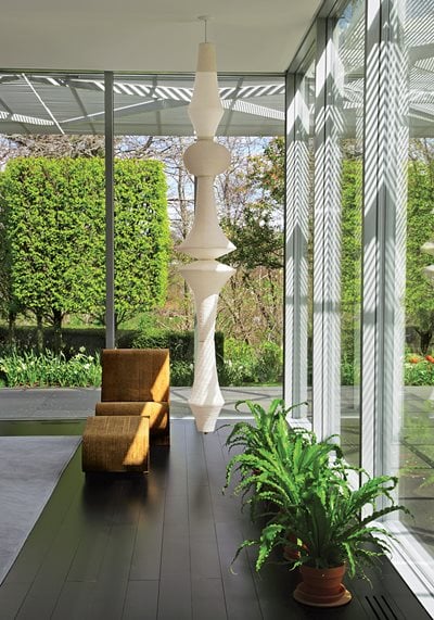
The master bedroom at midday is dappled with light patterns created by the house’s canopy. The strict horizontals of the hornbeam hedge, boxwood, and pathway emphasize the geometry of the house. At night, the floor-to-ceiling white Isamu Noguchi light sculpture—one of eight in the house—provides a soft illumination that blurs the home’s sharp lines and envelops the bedroom in a soft glow. Photo by: Don Freeman.
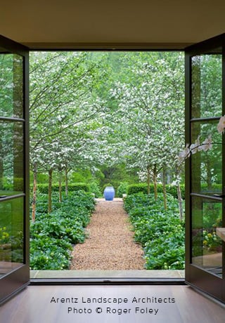
Though designed for the original commodious 1926 colonial, the rest of the garden adapted easily to the modernist style of the new house. This is partly because Armstrong, drawing on his long association with contemporary art, based the garden on the principles of midcentury abstract painting. “There are basically two different styles of abstraction in 20th century art—geometric abstraction and biomorphic abstraction,” Armstrong wrote in A Singular Vision, his book about the house that was published posthumously in December. He incorporated both styles of abstraction, trimming the linden allée and the boxwood and hornbeam hedges into straight lines that precisely paralleled the shore and horizon. On the inland side of the house, he instructed Wheelock to carve out lyrically curving paths and organically shaped “rooms,” leaving plenty of space for him to do his own planting, chiefly his beloved daffodils. They left untouched the boulders that erupted from the turf and reminded Armstrong of the smooth, rocklike forms that show up in artist Ellsworth Kelly’s paintings.
When the house was complete, Armstrong was pleased to find that its interaction with the elements also complemented the two abstract styles. “We discovered that the skylights, in conjunction with the scalloped ceiling, project different shapes on the walls,” says Whitney. “This extremely rectilinear box makes the light curvilinear.”

The path to the pool garden runs between rhododendron with Carex elata ‘Bowles Golden,’ European ginger, and blue-flowering Hyacinthoides hispanica. Photo by: Don Freeman.
The symbiosis of house and garden extends to the furniture and particularly to the art on the walls. Edward Dugmore’s untitled 1954 canvas—an abstract map of red smudged with blue and yellow—is meant to be taken in with the scarlet blooms of Coleus ‘Big Red Judy’ and Persicaria amplexicaulis ‘Firetail’ in the background. The standout antique Japanese screen is a foil for the American artwork in the house but also brings landscape into the interior. Outside, a flagged path bends in imitation of the bridge depicted on the screen.
Very little was left to chance, from the color of the rock retaining wall — both when dry and when wetted by rain — to the unruly beach roses. “Dad wanted them carefully pruned level to emphasize the slope of the ground to the horizon,” says Whitney.

Away from the rigorous modern lines of the house, the garden’s curves assert themselves in gently winding beds and paths, the snaking trunks of honey locust trees, and the swags of pruned hydrangea rolling over the perimeter wall. Photo by: Don Freeman.
The meticulousness that makes this second house a masterwork also made Armstrong who he was. Whitney recently found a testament to his father’s scrupulous attention to detail while sorting through the latter’s effects: luncheon seating arrangements Armstrong filed away years before. Now Whitney and his siblings struggle with the demands of maintaining the property — from ordering hundreds of annuals each year to keeping algae off the retaining wall. But they can take comfort in knowing their efforts are more curatorial than janitorial. They are preserving a place where art and architecture, landscape and sea, serve an overweening idea of high culture. A friend who often visited both Hoover Hall and Armstrong’s new house says simply, “It’s his last museum.”
This article first appeared as "One Last Hurrah" in our April 2012 issue.
See more gardens in New England.
