Modern Beach Bungalow in Malibu
A dilapidated backyard overlooking the Malibu Bluffs is transformed into a beautiful outdoor oasis. Published 8/4/2022The husband and wife design team, Ryan and Kate Gross (Kate Anne Designs) spent a year transforming the property from a lackluster, dilapidated backyard to an elegant and modern oasis overlooking the Malibu Bluffs.

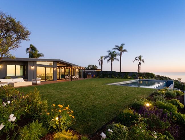
The modern beach bungalow was transformed using simple hardscape design as an intentional way to focus on stunning views of the Malibu bluffs and ocean. Kate infused the design with lots of lush, colorful plantings which creates a year-round lush East Coast look that the clients loved. Photo by: Alex Zarour / Virtually Here Studios.

The wood fencing was stained with a dark gray so that it would visually recede into the surrounding landscape and prioritize the ocean views. Photo by: Alex Zarour / Virtually Here Studios.

The pergola offers a clean and seamless look with no visible hardware or welds, and discrete infrared heaters were incorporated into the structure. Photo by: Alex Zarour / Virtually Here Studios.

The string lights offer a soft cozy glow, resulting in a look that is clean, simple, elegant, and uncomplicated. Kate used a natural bluestone slab counter with an Ipe facade for the BBQ island to create an elegant simplicity with limited materials. Photo by: Alex Zarour / Virtually Here Studios.
There were a few aspects of this project that we wanted to know more about, and posed the following questions to the designers, Ryan and Kate:
What were you most surprised about on this project? What surprised the owners? The site was quite busy before and distracted from the serene mountain and ocean views. The architect, homeowner, and design team all had the same gut feeling—pull back and keep it simple. This aesthetic is harder to accomplish than one would imagine. As a result, we were all surprised how much this paid off and opened up the entire property to frame these breathtaking views!
The transformation was huge! How were you clear with the owners on what the final design would look like? Over many meetings, we listened and collaborated with what the homeowners wanted. Anytime a detail was mentioned or a design aspect was revised, this was quickly updated on the blueprint and relayed to the architect and homeowners. This helped keep the communication open, which is VERY important in construction. We were very thorough in preparing conceptual image packages that, along with a detailed blueprint, gave the clients a clear idea of how the final product would look and feel.
What was the decking selection? Why? The decking is 5/4 x 6 Ipe that we added a brightening agent to, which strips the color tannins from the wood, helping to speed up the grey patina look we all love. The homeowners are from the East Coast and they really wanted to see that classic Hamptons boardwalk feel. The 5/4 x 6 Ipe spec is really for durability with the coastal climate, salt air, etc. Ipe is also referred to as “iron wood” because of its durability and natural resistance to decay even without being oiled.
Any rules of thumb for optimal spacing for outdoor dining? We like to leave 36” of table space per chair to allow for elbow room. If a table backs up to a wall, we like to leave at least 36” between the table and wall, preferably 48”. If there is a path or circulation behind the table, we like to give it 60” to 72” from table to wall.
Infinity pools—any tips on getting it right? We have to hand a lot of credit to the architect (von Studnitz Architects, Inc.) who single-handedly space planned the infinity pool layout. The Kate Anne team managed the selection of all pool materials: Bluestone coping for a blended East Coast feel and blue square waterline tile for a seamless modern touch.
The pool plaster was quite the feat! It was very important to the homeowners for the pool water color to blend with the ocean beyond, especially being an infinity pool. With lots of research and field tests, it came out better than we’d hoped!
